In an era where data reigns supreme, organizations face the challenge of not just collecting information but making sense of it. Every click, transaction, and interaction generates data—sales numbers, customer preferences, operational metrics, and more. Yet, without the right tools, this wealth of information remains a tangled mess, inaccessible to those who need it most. Enter Business Intelligence (BI) data visualization, a transformative approach that turns raw data into vivid, interactive visuals like charts, graphs, dashboards, and heatmaps. By doing so, it empowers businesses to uncover insights, streamline operations, and drive performance to new heights.
This blog dives deep into how BI data visualization revolutionizes organizational success. We’ll explore its core benefits, practical applications, implementation strategies, and even peek into its future—all backed by detailed tables and actionable pointers.
Book a demo to experience the meaningful insights we derive from data through our analytical tools and platform capabilities. Schedule a demo today!
Request a Demo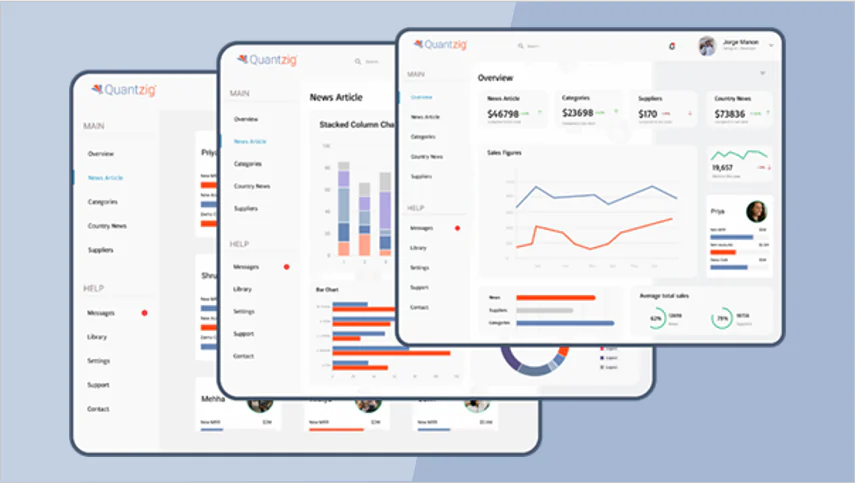
Table of Contents
What is BI Data Visualization?
BI data visualization is the art and science of presenting complex datasets in a graphical format using specialized tools like Tableau, Power BI, Looker, or Domo. It goes beyond static reports, offering dynamic, interactive interfaces where users can filter data, zoom into specifics, or explore trends with a single click. Think of it as a translator that converts rows of numbers into a language everyone—from C-suite executives to frontline staff—can understand and act upon.
For instance, instead of poring over a spreadsheet to find out which product is underperforming, a bar chart can instantly highlight the laggard in red. This immediacy and clarity are what make BI data visualization a cornerstone of modern business strategy.
Key Ways BI Data Visualization Improves Business Performance
Let’s break down the transformative power of BI data visualization with detailed examples, pointers, and supporting tables.
1. Faster Decision-Making
In business, hesitation can cost millions. BI data visualization accelerates decision-making by presenting critical insights in an instant. Imagine a CEO reviewing a dashboard that shows real-time sales dips across regions—no need to wait for a lengthy report.
- Pointer: Use color-coded visuals (e.g., red for declines, green for growth) to prioritize urgent actions.
- Example: A grocery chain spots a sudden drop in online orders via a live dashboard and quickly launches a promotional campaign, recovering 20% of lost sales within a day.
2. Identifying Trends and Patterns
Data holds stories—rising customer demand, seasonal slumps, or unexpected spikes. BI visualization brings these narratives to life, making it easy to spot patterns that inform strategy.
- Pointer: Combine time-series line graphs with annotations to mark significant events (e.g., a product launch).
- Example: A travel agency uses a trend chart to notice a 30% increase in bookings every July, prompting targeted summer marketing campaigns.
3. Enhanced Collaboration Across Teams
Siloed data creates silos in thinking. BI visualization bridges this gap by offering a single, visually intuitive source of truth that teams can rally around.
- Pointer: Share dashboards via cloud platforms to ensure real-time access for remote teams.
- Example: A product development team and sales team collaborate on a shared funnel chart, aligning efforts to boost conversion rates by 15%.
4. Improved Operational Efficiency
Inefficiencies—like overstocked warehouses or delayed shipments—drain resources. BI visualization pinpoints these issues with precision, enabling proactive fixes.
- Pointer: Use Sankey diagrams to visualize workflow bottlenecks.
- Example: A manufacturer sees via a heatmap that one factory line consistently underperforms, leading to a maintenance overhaul that cuts downtime by 25%.
5. Better Customer Insights
Customers are the heartbeat of any business, and understanding them is key to growth. BI tools visualize customer data—demographics, buying habits, satisfaction scores—into actionable insights.
- Pointer: Leverage bubble charts to compare customer segments by size and profitability.
- Example: A subscription service discovers via a pie chart that 70% of cancellations come from users aged 18-24, prompting a youth-focused retention strategy.
6. Revenue Growth and Forecasting
BI visualization isn’t just retrospective—it’s predictive. By pairing historical data with forecasting models, it helps organizations plan for profit.
- Pointer: Overlay actual vs. projected sales on an area chart for clear comparisons.
- Example: A tech startup uses a forecasting dashboard to predict a 10% revenue dip in Q3, adjusting budgets to maintain profitability.
Core Benefits of BI Data Visualization
| Benefit | Impact on Business | Key Visual Tool | Time Saved |
|---|---|---|---|
| Faster Decision-Making | Reduces analysis time, enabling rapid responses | Interactive Dashboard | Hours to Minutes |
| Trend Identification | Reveals patterns for strategic planning | Line Graph | Days to Hours |
| Team Collaboration | Aligns departments with shared insights | Funnel Chart | Varies by Team Size |
| Operational Efficiency | Identifies and resolves inefficiencies | Heatmap | Hours to Days |
| Customer Insights | Enhances targeting and satisfaction | Pie Chart | Days to Hours |
| Revenue Growth | Supports forecasting and revenue optimization | Area Chart | Weeks to Days |
BI Tools and Their Strengths
| Tool | Best For | Visualization Specialty |
|---|---|---|
| Tableau | Advanced analytics, large datasets | Interactive Dashboards |
| Power BI | Microsoft ecosystem integration | Real-Time Charts |
| QlikView | Associative data exploration | Funnel Visuals |
| Looker | Cloud-based, customizable workflows | Heatmaps |
| Domo | Executive-level insights | Predictive Area Charts |
Real-World Applications of BI Data Visualization
- Retail: A fashion retailer uses a geographic sales map to identify underperforming stores, reallocating inventory and boosting regional revenue by 18%.
- Healthcare: A hospital visualizes patient wait times on a bar chart, reducing delays by optimizing staff schedules—patient satisfaction rises by 22%.
- Finance: A hedge fund tracks stock volatility with candlestick charts, executing trades 30% faster than competitors relying on manual analysis.
- Manufacturing: A car maker monitors production line efficiency with real-time gauges, cutting waste by 12% after spotting overuse of materials.
- Education: A university uses enrollment trend visuals to predict student intake, adjusting marketing budgets to fill 95% of seats.
Industry-Specific Use Cases
| Industry | BI Visualization Use | Tool Example |
|---|---|---|
| Retail | Sales by region/store | Tableau |
| Healthcare | Patient wait times, resource allocation | Power BI |
| Finance | Market trend analysis | QlikView |
| Manufacturing | Production efficiency monitoring | Looker |
| Education | Enrollment forecasting | Domo |
Get started with your complimentary trial today and delve into our platform without any obligations. Explore our wide range of customized, consumption driven analytical solutions services built across the analytical maturity levels.
Start your Trial TodayHow to Implement BI Data Visualization Effectively
Deploying BI data visualization isn’t just about picking a tool—it’s about strategy. Here’s a detailed roadmap:
Define Clear Objectives
- Pinpoint KPIs like profit margins, customer lifetime value, or delivery times to guide your visualization focus.
- Example: A logistics firm targets on-time delivery rates, building a dashboard around this metric.
Choose the Right Tools
- Match tools to your needs: Tableau for deep analytics, Power BI for affordability, or Domo for executive summaries.
- Pointer: Assess scalability—can the tool grow with your data volume?
Ensure Data Quality
- Integrate disparate sources (e.g., CRM, ERP, social media) and clean inaccuracies to avoid misleading visuals.
- Example: A retailer merges online and in-store sales data for a holistic view.
Design Intuitive Visuals
- Prioritize simplicity: a cluttered dashboard confuses rather than clarifies.
- Pointer: Limit each visual to 2-3 metrics (e.g., sales and profit, not sales, profit, and 10 other variables).
Train Your Team
- Equip staff with skills to interpret visuals and customize dashboards.
- Example: A 2-hour Power BI workshop cuts report generation time by 50%.
Monitor and Iterate
- Regularly refine visuals based on user feedback and changing priorities.
- Pointer: Schedule monthly reviews to keep dashboards relevant.
Challenges and Solutions
| Challenge | Impact | Solution | Tool Support |
|---|---|---|---|
| Data Overload | Overwhelms users | Focus on key KPIs | Tableau Filters |
| Resistance to Adoption | Slows implementation | Showcase quick wins | Power BI Templates |
| Misinterpretation | Leads to wrong decisions | Add context, train staff | QlikView Tooltips |
| High Initial Costs | Budget constraints | Start with free/low-cost options | Domo Free Trial |
The Future of BI Data Visualization
The horizon is bright for BI visualization:
- AI Integration: Tools will auto-generate insights, e.g., “Sales dipped due to a competitor’s discount.”
- Augmented Reality (AR): Executives might walk through 3D data models in virtual meetings.
- Natural Language Queries: Ask “What’s my profit trend?” and get a chart instantly.
- Real-Time IoT Integration: Visualize data from smart devices (e.g., factory sensors) as it streams.
These innovations will make BI even more intuitive, amplifying its impact on business performance.
Conclusion
BI data visualization is a superpower for modern organizations. It turns abstract numbers into compelling stories, enabling faster decisions, sharper strategies, and stronger bottom lines. From spotting a sales dip on a dashboard to forecasting next quarter’s growth with a predictive chart, it’s a catalyst for efficiency, collaboration, and innovation. The tools are here, the benefits are clear—now it’s up to organizations to harness this potential. Start with a single visualization, and watch it transform the way you work.
Experience the advantages firsthand by testing a customized complimentary pilot designed to address your specific requirements. Pilot studies are non-committal in nature.
Request a Pilot